033. City monitor: the latest data
Introduction
This section provides a detailed analysis of the 64 largest cities in the UK, drawing on a range of datasets released in 2014.
- Population
- Business dynamics
- Innovation
- Employment
- Skills
- Earnings
- Disparities
- Housing
- Environment
- Digital connectivity
For most indicators the 10 strongest and 10 weakest performing cities are presented only. Tables of the full list of cities can be found on centreforcities.org/data-tool
Box 2: Definition of the public sector
In this analysis as in previous analyses by Centre for Cities, the public sector is defined as:

While this definition will include some private sector employment, such as private hospitals, it does give a consistent estimate of public sector employment over the 10-year period.
BRES & ABI are used to measure the number of jobs here as they are the only dataset provided by ONS that allows jobs to be measured by sector at the local authority level.
Population
Growing populations can give an indication of the economic opportunity that is available in cities. Cities that provide many job opportunities are likely to retain and attract more people than cities that do not.
- 54 per cent of the UK’s population live in cities. The UK’s four biggest cities – London, Birmingham, Manchester and Glasgow – account for 23.6 per cent of the UK’s population (with London alone home to 15 per cent), and 43.8 per cent of those living in cities.
- 19 out of 64 cities experienced double digit percentage growth over the decade to 2013.
- The top three cities – Milton Keynes, Peterborough and Swindon – experienced rates of population growth more than double the national average between 2003 and 2013.
- Only one city – Sunderland – experienced a decrease in population over the 10-year period, with Burnley’s population remaining the same size.
Table 1: Population growth
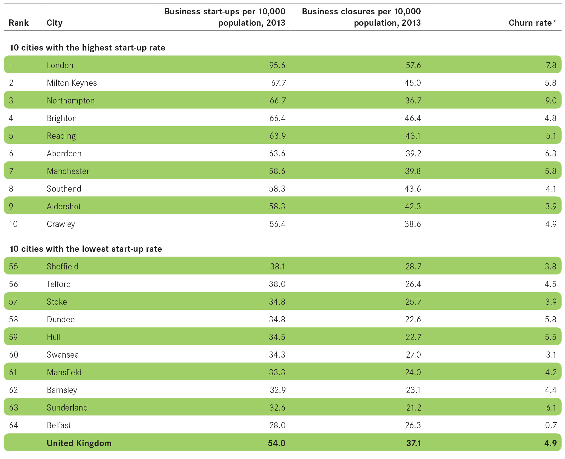
Business dynamics
Strong city economies depend on the dynamism of businesses and entrepreneurs. The overall number of businesses in a city and the rates at which businesses are starting up and closing down are key indicators of the health of a city’s economy.
Business starts and closures
- 60 per cent of all new UK businesses were in cities in 2013, with the number of start-ups increasing by 30 per cent compared to 2012.
- For the first time since 2007, every city in the UK had more businesses start than close in 2013.
- There are several big movers in the rankings from last year.
- Plymouth had 15 more start-ups per 10,000 population in 2013 compared with the previous year and moved 14 places up the table to 42nd.
- Blackburn also improved significantly, moving nine places to 28th.
- London once again topped the rankings with 95.6 business start-ups per 10,000 population and had 41 per cent more start-ups than the second highest city, Milton Keynes (67.7). The capital also had the highest number of business closures with 57.6 closures per 10,000 population, 53 per cent higher than the national average.
Figure 2 Business starts per 10,000 population
Business stock
- Cities were home to 54 per cent of all UK businesses in 2013.
- While large cities accounted for 35 per cent of all UK business, the top 10 is dominated by small and medium-sized cities when measuring on a population basis.
- London accounted for a fifth of all UK businesses and had 18 per cent more businesses per 10,000 population than the next highest city Brighton.
- Only four cities in the top 10 increased the relative size of their business base above the national average, whereas seven of the bottom 10 surpassed this. Liverpool, Middlesbrough and Plymouth saw the greatest change with increases of more than 6 per cent.
- The geographical differences between the top 10 and bottom 10 cities are stark. Eight of the top 10 cities are located in the Greater South East and eight of the bottom 10 cities are located in the North.
Figure 3 Business stock per 10,000 population

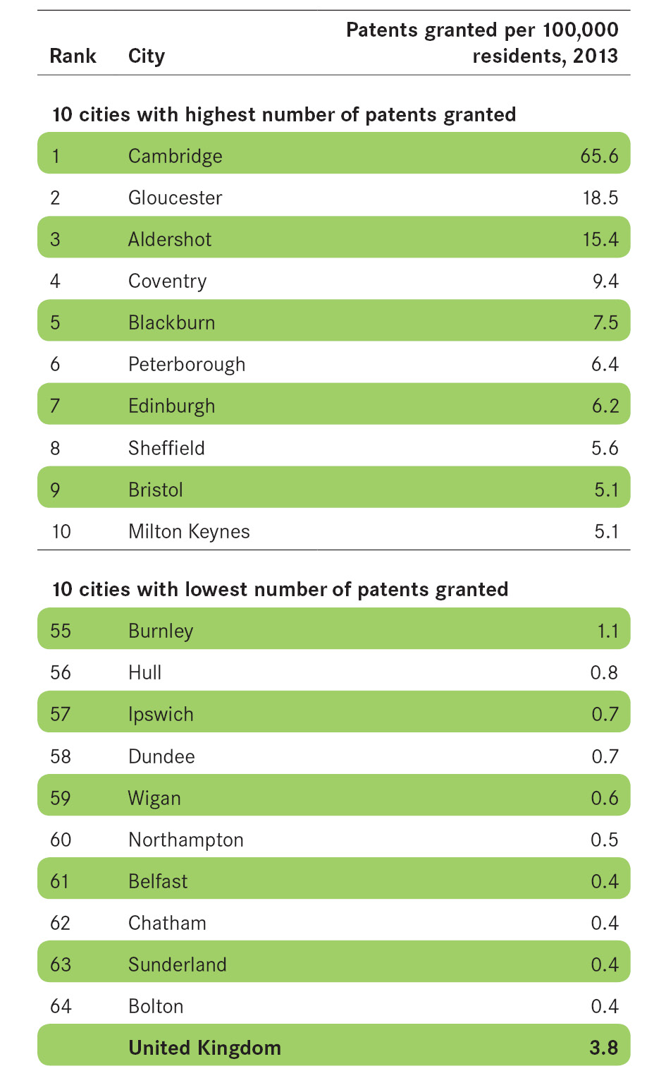
Innovation
Innovation is a driver of long-run economic growth. Finding new or better ways of making goods or delivering services improves the performance of businesses which in turn increases the capacity of city economies.
Patents granted
- 53 per cent of patents registered in the UK were registered in cities.
- More patents were granted per 100,000 people in Cambridge than in the next six highest cities combined. However, London leads the way in the number of patents registered with 17 per cent of the UK total.
- Medium-sized cities are the most innovative. Within these cities, innovation is driven by different industries; in Gloucester and Aldershot it is focused around the aerospace and defence industries, whereas in Coventry and Peterborough a large share of patents are registered by the automotive industry.
- In most cities innovation is typically dispersed across several businesses, but in Edinburgh and Blackburn a single firm accounts for almost 50 per cent of patents registered.
Box 4: Measuring innovation
Patent data is widely used to measure innovation. Patents are registered with the Intellectual Property Office and have an address allocated to them making it possible to assign them to a particular city.
However, we note that using patent data is an imperfect measure of innovation. There is no way to verify that the innovative activity happened at the address on that application.
Patents also only demonstrate more technical innovations and exclude process innovations, trademarks and creative innovation, much of which takes place within service sector businesses.
However, while patents do not cover all forms of innovation, they do act as a good proxy, and there is large variation across the country.
Figure 4 Patents Granted per 100,000 population
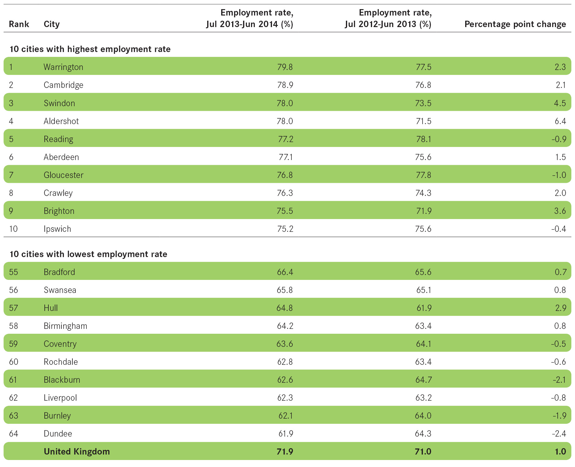
Employment
High employment rates, low unemployment rates and strong jobs growth point to well-functioning labour markets, with the demand for workers amongst employers being high. Low employment rates, high unemployment and weak jobs growth suggest weak labour markets.
Employment rate
- 42 out of 64 cities increased their employment rate in 2014 and 22 did so by two or more percentage points.
- 36 cities had employment rates below the national average. To bring these cities up to the national average, an extra 546,100 residents in those cities would need to find employment.
- Dundee, which had the lowest employment rate of 61.9 per cent (10 percentage points below the national average), would need 9,510 of its residents to find jobs to bring the city in line with the national average.
- Seven of the top 10 cities are within 80 miles of London, while Warrington remained the only city in the North of England to make the top 10. At the other end of the scale, six out of the 10 bottom cities are concentrated in the North West and Yorkshire regions.
Figure 5 Employment rate
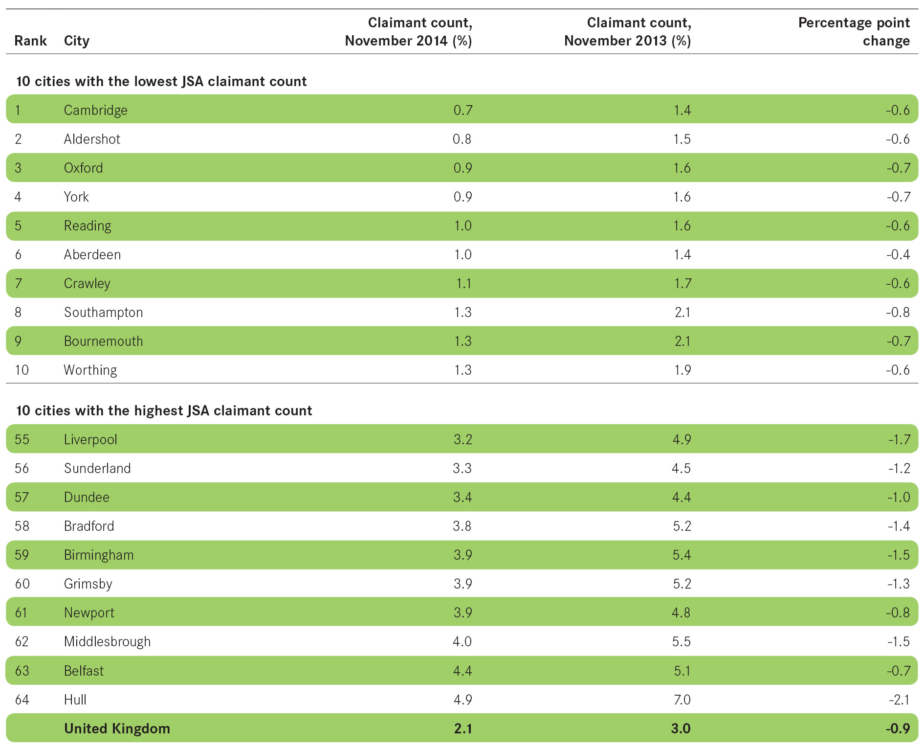
Unemployment
- Nearly two thirds (65.5 per cent) of those claiming Jobseekers’ Allowance live in cities.
- All cities experienced reductions in the number of working age residents claiming Jobseekers Allowance between November 2013 and November 2014.
- Cities accounted for 70 per cent of the reduction in JSA claimants in 2014, with 235,500 fewer claimants in cities compared to 2013, out of a UK total of 375,000.
- While Hull had the highest claimant count, it also saw the largest decrease of claimants with more than 3,500 residents no longer claiming.
Figure 6 Claimant count
Private sector jobs growth
- 48 cities saw an increase in their number of private sector jobs.
- The top 10 cities added 193,900 net private sector jobs to the national economy in 2013, nearly 60 per cent of all national private sector net jobs growth.
- Barnsley, Coventry and Milton Keynes each experienced more than 7 per cent growth in private sector jobs.
- 15 cities experienced a reduction in private sector jobs in the year 2012-13 with Edinburgh, Newport and Sunderland seeing reductions of more than 2 per cent.
- Edinburgh was the hardest hit, suffering a loss of 4.9 per cent of its private sector jobs, with the biggest job losses being in the business administration and support sector. Aldershot also experienced a significant shift in its ranking, moving from first (9.4 per cent increase) in 2012 to 57th (1.4 per cent decrease) in 2013.
Figure 7 Private sector jobs growth

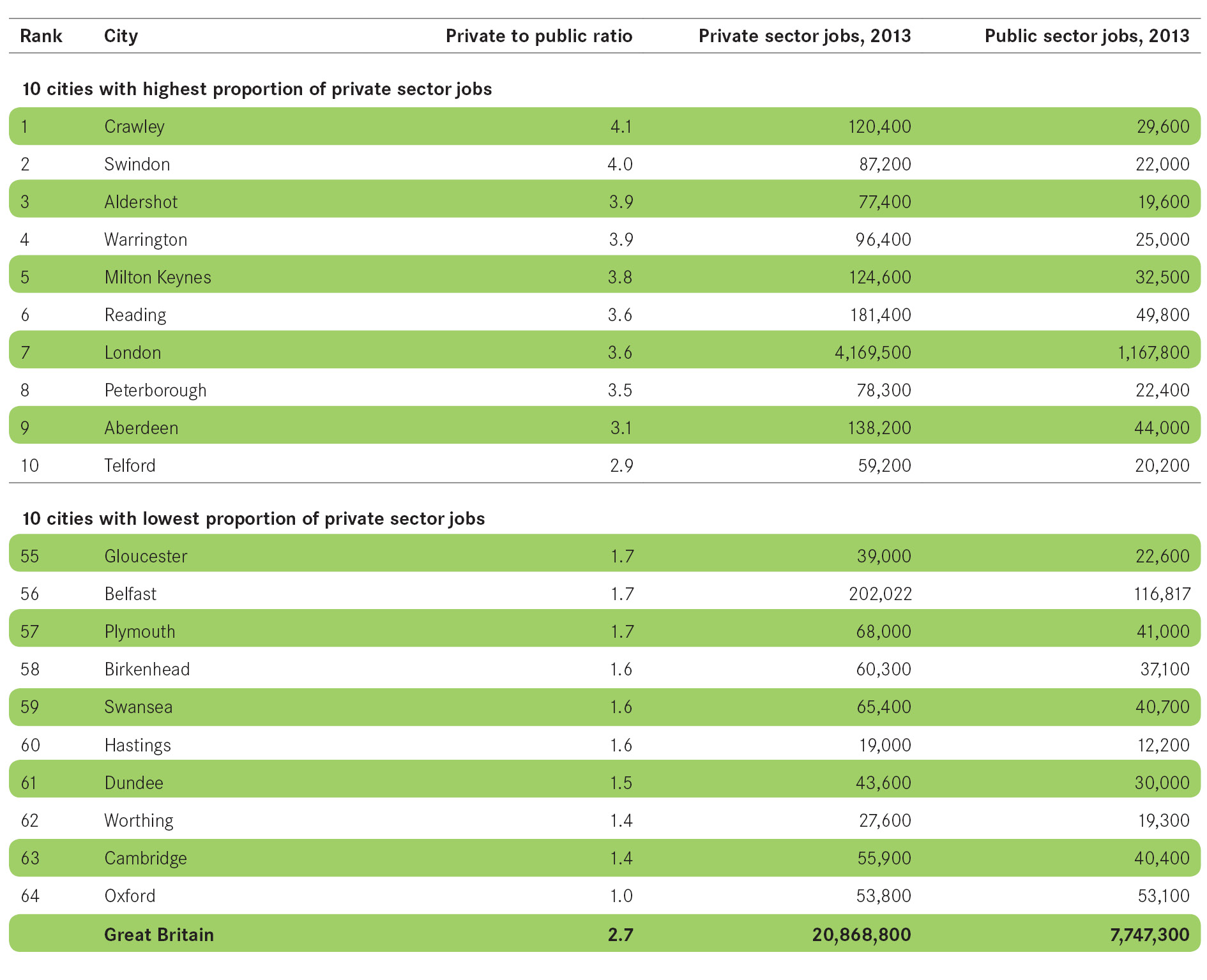
Links between public and private sector jobs
- 49 out of 64 cities were more reliant on the public sector than the national average.
- Of the larger cities, only Leeds, London and Manchester had a greater share of private sector jobs than the national average.
- While Swindon and Crawley had four private sector jobs for every one in the public sector, at the bottom of the table Oxford had an equal number of each on account of its two universities.
- The city with the biggest change in its public to private ratio from 2012 was Rochdale, which lost 13 per cent of its public sector jobs in 2013, bringing it in line with the national average of 2.7 private sector jobs to every public sector job.
Figure 8 Ratio of private sector to public sector jobs
Skills
Skills levels are a key component of the success of a city economy. Those cities that have a higher proportion of graduates tend to have stronger economies than those that have a large number of people with no formal qualifications.
High level qualifications
- Cities are home to 59 per cent of the UK’s high-skilled people.
- Cities in the Greater South East accounted for 20 per cent of the total working age population but 26 per cent of the UK’s high-skilled population.
- Scottish cities also had a greater percentage of high-skilled people relative to total working age population, with 3 per cent of the UK working age population, but 4 per cent of its highly skilled working age population.
- English cities outside the Greater South East and South West accounted for 21 per cent of the UK’s high-skilled population while being home to 25 per cent of the total working age population.
- In the bottom 10 cities, Southend and Chatham are the only two cities located in the Greater South East.
Figure 9 Residents with high level qualifications

No formal qualifications
- Cities are home to 60 per cent of the UK population that have no formal qualifications.
- Three of the UK’s largest cities – Birmingham, Liverpool and Belfast – had some of the highest proportions of people with no formal qualifications.
- Unsurprisingly there was a strong relationship between those cities with high percentages of no formal qualifications, high JSA claimant counts and low employment rates, such as Birmingham, Liverpool and Bradford.
- Two cities had highly polarised skills profiles:
- Glasgow had the eighth highest proportion of highly skilled residents, but also had the 12th highest share of residents with no formal qualifications.
- Belfast also ranked 18th for the share of highly skilled residents and had the fourth highest share of residents with no formal qualifications.
Figure 10 Residents with no formal qualifications

Earnings
Workforce earnings reflect the types of jobs available in cities. Those cities that have higher wages are likely to have a greater number of high-skilled jobs than those that do not.
Earnings growth
- In 2014, the average workforce weekly earnings in cities were £538, compared with the UK average of £501.
- Workers in 14 cities earned above the national average in 2014. But only four of these (Aberdeen, Derby, Edinburgh and Coventry) are located outside the Greater South East.
- Seven cities – Aberdeen, Birkenhead, Blackpool, Dundee, Portsmouth, Southampton and Stoke – saw a real terms increase in their workers’ weekly wages of more than £20, with Blackpool experiencing the largest increase of £44.
- Two thirds of UK cities saw their real weekly wages fall in 2014 overall. Average real earnings decreased by £8 per week in 2014 to £538 per week, although this was still £37 more than the national average.
- Nearly 30 per cent of cities saw their workers’ wages decrease by more than £20 per week in real terms, with Burnley, Northampton and Wigan seeing a decrease of over £35.
- Huddersfield had the lowest average weekly workforce wage, and saw a real earnings loss of £34. The gap between the top city – London – and the bottom city – Huddersfield – widened; workers in London now earn on average £282 more per week than workers in Huddersfield.
Figure 11 Average workplace earnings

Disparities
Inequalities within cities are often starker than between cities. Disparities within cities arise as a result of large differences between neighbourhoods with high claimant rate areas and those with none.
- All UK cities have neighbourhoods with almost no JSA claimants living in them.
- All of the UK’s 11 largest cities have big differences between highest and lowest JSA rate neighbourhoods, much higher than the national average. Two thirds of small cities have a smaller difference than the national average, indicating greater inequalities within larger urban areas.
- Belfast had the neighbourhood with the highest number of JSA claimants as a share of working age population.
Box 5 Defining disparities
As in previous editions of Cities Outlook, we use the percentage point difference between a city’s lower super output area (LSOA)11 – neighbourhoods within a city with an average population of 1,500 – with the highest JSA claimant count and a city’s LSOA with the lowest claimant count as a proxy indicator for inequalities within a city. The measure is only a proxy – income data would serve as a better measure but is not made available on a comparable basis across cities.
Figure 12 Disparities within cities

Housing
Housing stocks and prices together provide useful insights into cities’ housing markets, showing both supply and demand measures.
Housing stock growth
- Cities account for 52 per cent of the UK’s housing stock.
- All cities except Dundee saw an increase in their overall housing stock between 2012 and 2013.
- Milton Keynes was again the city that added the most new housing as a proportion of its existing stock.
- While the top 10 cities increased the size of their housing stock by more than the national average, none of them increased it in line with their population growth.
Figure 13 Housing stock growth

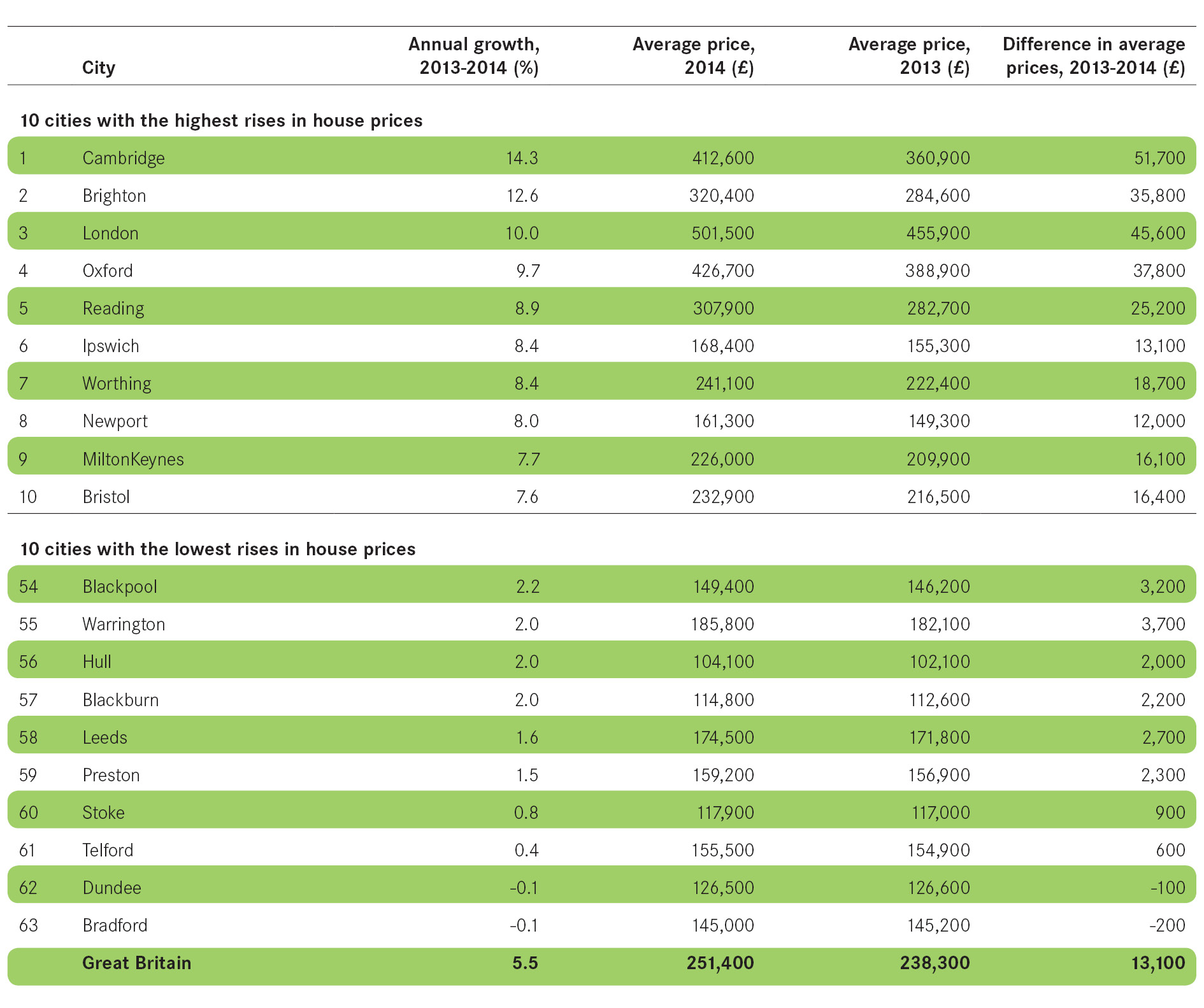
House prices
- 24 cities experienced house price increases between 2013 and 2014 at a rate above the national average of 5.5 per cent. 15 of these cities were within the Greater South East.
- Brighton, Cambridge and London all saw their average house prices increase by more than 10 per cent between 2013 and 2014, twice the national average of 5.1 per cent.
- The average house price in London (£501,500) was almost five times higher than that in Burnley (£104,200).
- With the exception of Scottish cities, the rate of annual growth decreases the further north you go. The top third of cities is dominated by southern cities (experiencing between 5.5 and 14.3 per cent growth), the majority of cities in the East and West Midlands are located in the middle third (between 3.5 and 5.4 per cent growth), while the bottom third of cities are predominantly located in the North West, Yorkshire and the North East (between 0.1 and 3.4 per cent growth).
Figure 14 House price growth
Environment
Accounting for over 80 per cent of total greenhouse gas emissions, CO2 emissions are one way to gauge how ‘green’ a city is and the size of its carbon footprint.
- Most cities saw a rise in carbon emissions per capita between 2011 and 2012, with only three cities experiencing a decrease (Blackburn, Derby, Newport) and two remaining the same (Sheffield, Telford). This is reflected in the UK national average which rose from 6.8 to 7.1 tonnes per capita in the year to 2012.
- Despite these increases, only eight cities had CO2 emissions per capita above the national average.
- Whilst large cities are significant emitters of CO2, they are very efficient when emissions are considered on a per capita basis. This is made clear in the case of London which accounted for 12 per cent of all UK emissions, but came 16th out of 64 cities with a CO2 emission of 5.4 tonnes per capita.
- Middlesbrough is by far the biggest emitter of CO2 with emissions of 25.6 tonnes per capita, a significant increase from 15 tonnes per capita in 2011.
Figure 15 CO2 emissions per capita
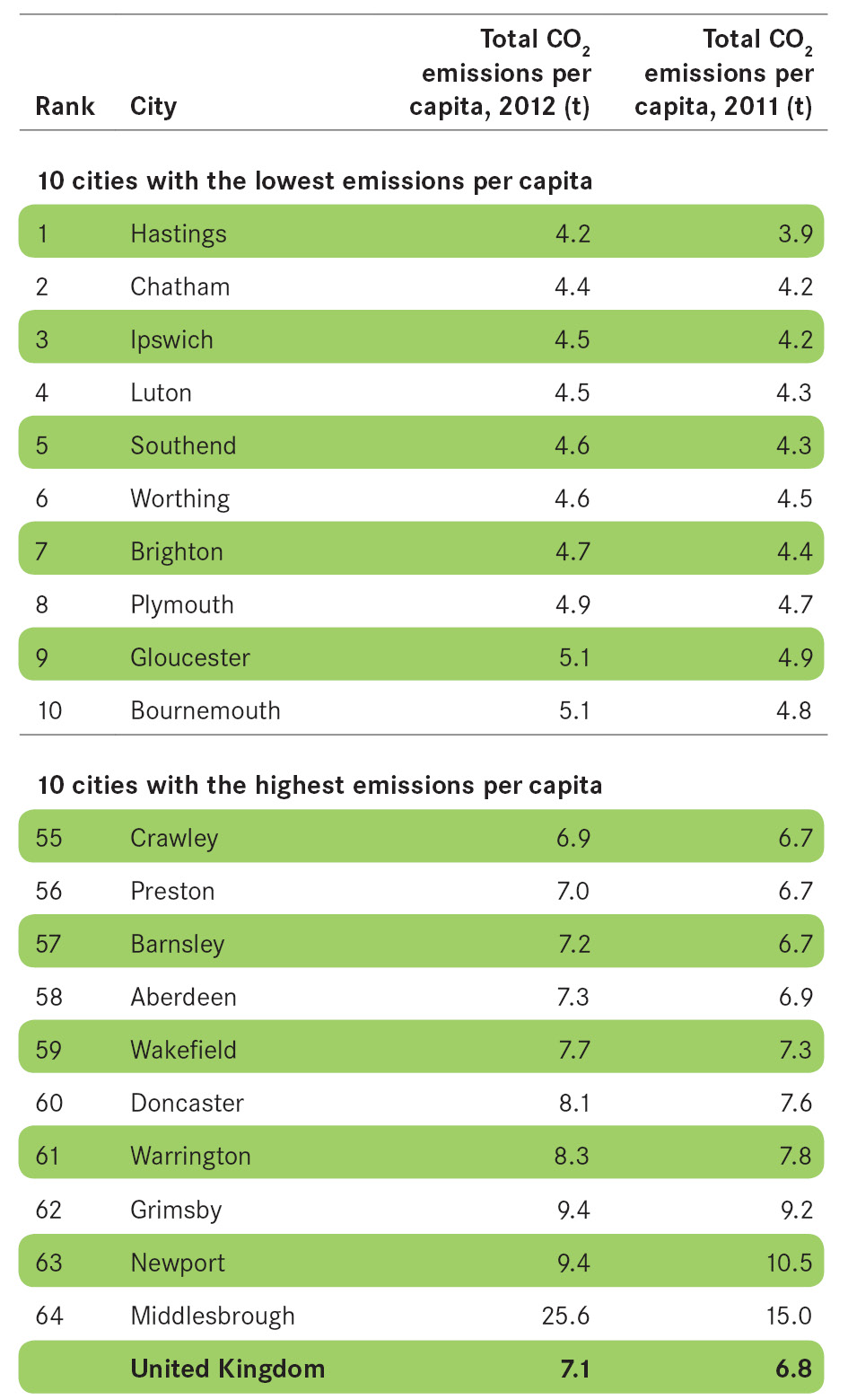
Figure 16 CO2 emissions per capita

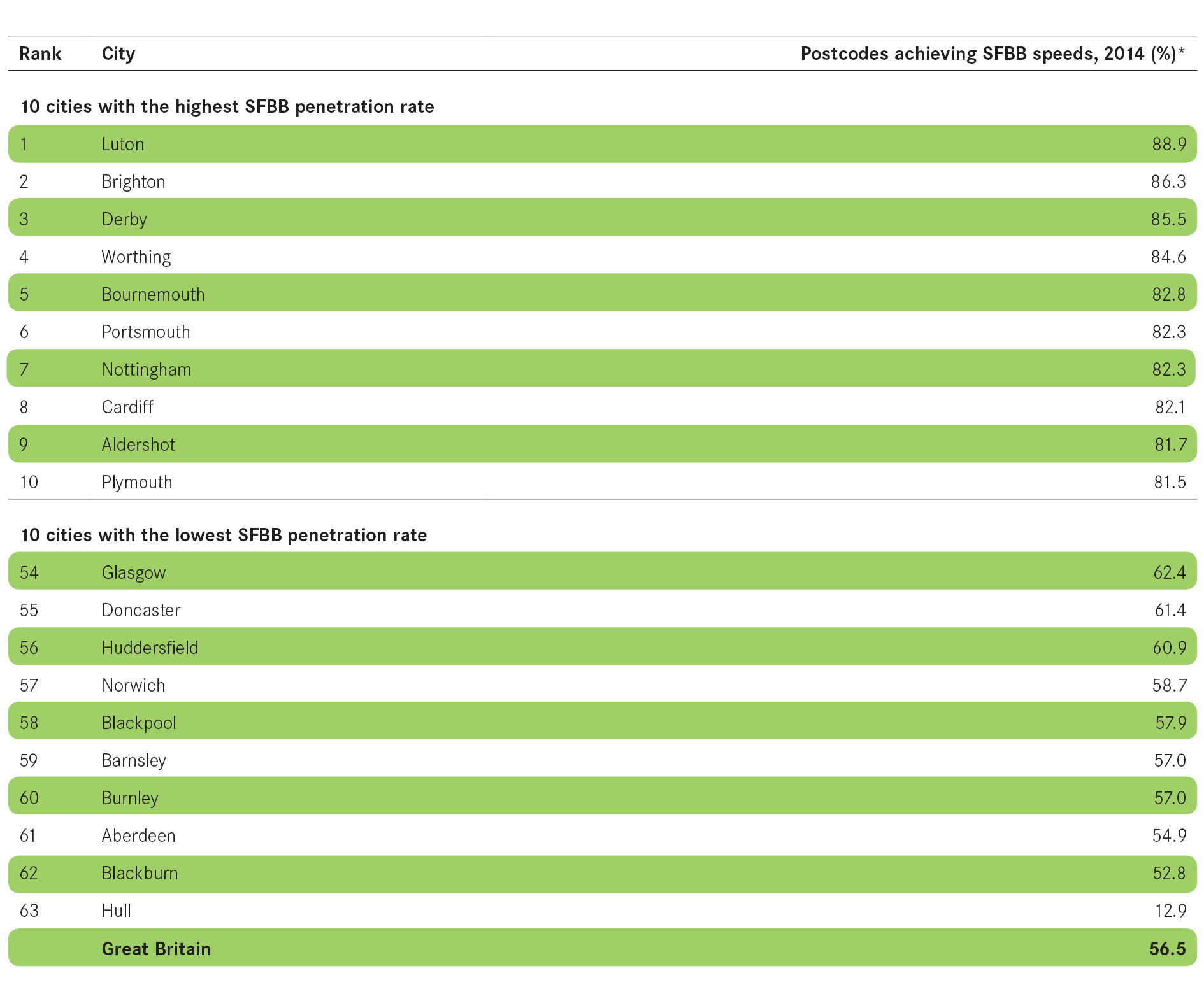
Digital connectivity
- Broadband connection is a key component of the infrastructure offer that a city can make to attract businesses and people, as well as support the growth of the existing business base.
- The percentage of fixed-line connections reaching super-fast speeds across cities in England, Scotland and Wales in 2014 was 72.9 per cent.
- This was over 1.5 times more super-fast connections, on a proportional basis, than in non-city areas, which achieved 42.8 per cent, over 16 percentage points more than the national average of 56.5 per cent.
- Seven of the top 10 cities – those with the highest percentage of postcodes achieving super-fast speeds – are situated in the South.
- At the other end of the table nine out of the 10 cities with the lowest percentage of fixed-line connections reaching super-fast speeds are situated in the North and Scotland, with cities in Yorkshire accounting for four of these.
Box 6 Defining digital connectivity
Cities Outlook uses Super-Fast Broadband (SFBB) as the indicator for measuring digital connectivity.
SFBB is defined by the Office of Communication (Ofcom) as 30 MB/s.* This is in line with European Union Digital Agenda’s standard that sets the threshold for SFBB.
Data for maximum broadband speed for each postcode is available from Ofcom. Some postcodes do not have data due to insufficient data or no premises, and these have been excluded from the analysis.
*Ofcom (2014), 2014 Infrastructure Report, London: Ofcom
Figure 17 Postcodes achieving super-fast broadband speeds